Over this past year, a few different people have asked me about the covers I’m creating for the short stories I’ve written. Some have wondered how I create them. It occurred to me that it might be fun to show you all the original photos I started with and the finished covers side by side so you can see how I decided what to keep, what to chop, and what to change in order to make a photo into a cover. This is going to end up a pretty long post, but I hope a pretty interesting one as well.
If I had been really smart, I would have tracked all of the changes I made to the photos so I could tell you exactly how to achieve particular effects in Photoshop. Alas, I did not do so. But messing around in Photoshop and seeing what you come up with is half the fun anyway. I didn’t really know what I was doing in several of these, so if I can end up with something compelling, so can you, even if you’re a newbie. (Also, it helps to have a husband who actually does know what he’s doing and can answer all my questions.)
Without further ado…
Beneath the Winter Weeds

Super simple because I started with a great photo. Crop, sharpen, layer one effect (don’t remember which!), and add text. You’ll see I kept the same fonts on every cover in order to give everything a family look, despite all the different colors and images.
The Door

Another one I didn’t change much beyond cropping. You’ll note that in all of these, I selected colors that were in the photo as the colors for the text. That’s one of the simplest ways to create more cohesion in a cover. If you choose colors form a chart, you’re going to get things that aren’t quite matches. Use the eye-dropper tool to select colors that are already in your photo to then color your text. Also, watch out for high contrast photos where it’s hard to find enough room to put a title that will be readable. In this photo, it was hard to find a spot for the already very short title where I could have it all one font color and yet still readable. I think I was pushing it on this one. “The” is very easy to read, while “Door” is a bit harder.
This Elegant Ruin

I hadn’t planned on putting my model on the cover at all–I only wanted to have the violin in the proper playing position. But Corissa had such an enigmatic look in her eye and I love this girl’s hair. With some adjustments for lighting and a warming filter, the whole cover has a very warm, honey glow to it. I smudged the background to create that rounded light (rather than have the straight windowsill) and created the illusion of movement on the bow using the same tactic. I remember having trouble placing the words, and even changed the title from its original (An Elegant Ruin) to achieve the right balance for the words. I then played with triangles in placement. There are three triangle shapes in this cover. Also, notice how much of the photo I didn’t use. Cropping is absolutely the most basic and effective way to turn a mediocre photo into a good one.
Also, this was one of only two photos I actually took after writing the story, for the purpose of a cover image. All the rest were photos I already had, some of them many years old.
We Shall Sometime Come to Someplace

I loved this rabbit. Problem was, the rabbit in the story is a wild one, not a gray domestic one. Wild rabbits are brown. This took a LOT of tries to get the right brown for the rabbit and the right brown for the background and those two layers were manipulated separately first, then together. It was hard to keep this from becoming just too dark.
Clean

Look how dark and crooked that original is! I did so much to this photo, I can’t even begin to tell you how I did it. Lots of strategic lighting adjustments, layer by layer, bit by bit. This was the other cover for which I asked a girl from church to model after I wrote the story. Elise didn’t bat an eye about getting in that dryer in full view of a number of people washing their clothes at the laundromat.
One Endless Summer Day

I knew I needed a ladybug for this. But she couldn’t be on a rock. I knew I needed a green plant for this. But it couldn’t be boring. So out came the lasso tool and a lot of patience, twisting and turning and shrinking and shadowing so it would look semi-real. I like the way it turned out in the end.
10 Degrees Cooler in the Shade

This was an image/title pair that preceded the story and I wrote the story to fit it. Not a lot of edits on the image. It was already quite eye-catching.
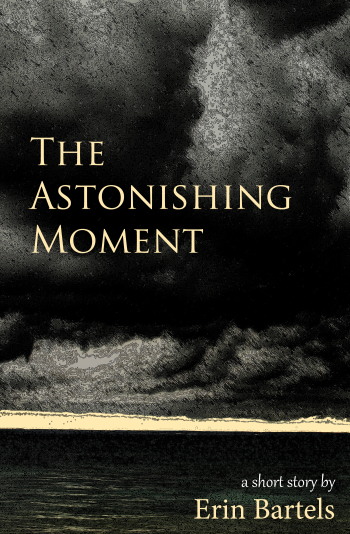
The Astonishing Moment

This may be the image that was worked over the most. When you see the original and final side by side it may not even see like the same photo. The cover image was cropped from the left side (see the lighter almost vertical line between the clouds?) and then I used several different artistic filters to make it look more illustrated, which fits with a bit in the story (although I didn’t realize it until I wrote this post). See the Mackinac Bridge in the distance in the original? Don’t let that fool you. The story actually takes place on Lake Superior.
The Beginning and the End

Cropped, flipped, brightened, and a little fun with the text. Not much more to say, except that this was one of the first images I shot with my macro lens when I got it.
Drive

This image was obviously cropped and brightened and I upped the color saturation. I also used an artistic effect (perhaps watercolor?). I didn’t have to blur it to make it look like there was movement down the road as I took this from the passenger seat one day when we were driving Up North.
Memory Man

This photo of the undergirding of a train bridge over the Lansing River Trail also serves as the basis of the background on my husband’s website. I needed something urban looking, but didn’t want the graffiti to compete with the words on the cover, so I rotated the photo 90 degrees and cropped out my cover image from what is really the top of the original photo (note the dark strip of rivets to orient your brain). Then I enhanced the colors, brightened, increased contrast, and added effects to make it less photoreal and more like a painting. I put the words vertical because of all the dark rust and even dropped an article because it didn’t really fit the design (it used to be called The Memory Man). A real graphic designer could have made it work, I’m sure. I also removed distracting dots of rust from beneath the words so that the title and author name can be easily read.
Water & Light

Lastly, another very simple one. Just a matter of cropping, brightening, and placing text. This one I haven’t written yet, haven’t started at all, and have barely thought about. It may or may not end up with some subtle tie to Christmas since it will be coming out in December. The title simply came from the building that is featured in the photo (and may or may not have anything to do with the eventual story), which is the Lansing Board of Water and Light building downtown. Built in the 1930s, it is a gorgeous place with Art Deco lines and stirring murals on the lobby walls. Modern public buildings just don’t compare. Anyway, we’ll see what story I can come up with to fit the cover and title.
And that makes twelve. Twelve photos, twelve covers, twelve stories. I’m busy working on Memory Man right now. This has been such a fun year-long experiment. I highly recommend you try it if you’re struggling with consistent writing. As you write you will hone your skills and short stories are far easier to finish than novels, thus giving you that satisfying feeling of typing out the last sentence far more often. We’re getting close to the end of the year. It may be time to start thinking up some writing goals for 2014…


You must be logged in to post a comment.