Portrait of a Landscape

Last month I shared a photo from an excursion to Fenner Nature Center and mentioned I’d like to paint it. Yesterday afternoon, I did.

January at Fenner Nature Center

I did it partly as an avoidance tactic (the couple-day warm up has made me think I really ought to clean out the garage) and partly because I’m stuck on manuscript revisions (until I can get a call with a criminal attorney who is out of town) and partly because this is a big reason I quit a bunch of stuff (unscheduled time for creative endeavors).

This time around I didn’t take pictures between each step because I was mostly working wet-on-wet and you have to work fast without letting things dry between washes. But I do have a side-by-side comparison for you.

FennerPaintingComp

I wasn’t trying to reproduce the photo, just to use it as a reference, especially for the low horizon and big sky you get with the portrait orientation. Taking all photos in a landscape orientation (even when you’re taking photos of people, traditionally called portraits) is an easy trap to fall into when you have a traditional camera in your hands. It’s how they’re oriented — buttons, hand holds, etc. — and it’s especially easy to only take landscape photos of…well, landscape. But turning the camera in your hands can give you a far different perspective on your subject.

Looking at the side-by-side, I’m thinking I could have tried to keep the light bits of the sky a little brighter yet. I could re-wet the sky and lay in some darker clouds to make the contrast greater, but, as I said before, there’s always the risk of overdoing it.

I think I’ll let well enough alone.

Painting the Self Portrait Step by Step

This morning seemed the perfect time to start my self portrait. Dawn was bright and the air outside a crisp 4 degrees Fahrenheit, so why not stay inside and fiddle with paints? Things turned out far better than I had anticipated. For those of you unfamiliar with watercolor painting, it’s done in stages, starting with the lightest and most translucent colors. Each wash gets gradually darker, and if you go too dark too fast, there’s only so much “erasing” you can do, because painting over something lighter doesn’t work — the darker color always shows through. So watercolors are fairly unforgiving. But I’ve found through the years of dabbling in it that I’m so drawn to watercolors done well, so I keep on trying to get better.

I thought it might interest you to see how one gets from a drawing through the various washes to the final product, so…

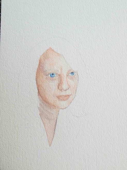
First there's a light line drawing (too much pencil shading can destroy a watercolor painting, so the key is to stop before you think you should).
First there’s a light line drawing (too much pencil shading can destroy a watercolor painting, so the key is to stop before you think you should). This photo distorts the drawing a bit on the squatty side. Better angles on the rest…
Next lay a light wash (you can always go darker). Mine is a mixture of burnt sienna and alizarin crimson.
I added cobalt blue to the skin mixture to get the tone for the shadows and used a darker wash of the original, with a bit more of the red, for the lips.
Cobalt blue for the eyes, starting light. I'll add some payne's gray to the blue in a later wash.
Cobalt blue for the eyes, starting light. I’ll add some payne’s gray to the blue in a later wash.
This is where I figured I'd really mess up. When you first start adding dark colors it's a little nerve wracking because they are so hard to fix if something goes wrong.
This is where I figured I’d really mess up. When you first start adding dark colors it’s a little nerve wracking because they are so hard to fix if something goes wrong.
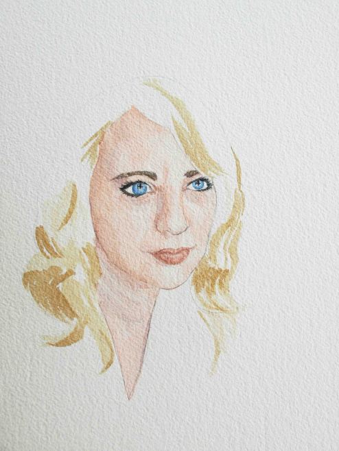
Now for the hair. Lay in the lighter warm highlights first. I used raw umber for mine. I also darkened the lips a bit at this point.
Here's where I really started thinking this would not work. The hair just didn't feel as nicely rendered as the face, though I knew most of it would get swallowed up by the black background eventually. The reddish brown tones in my hair are done with burnt sienna. The darker the color the less water I mixed in.
Here’s where I really started thinking this would not work. The hair just didn’t feel as nicely rendered as the face, though I knew most of it would get swallowed up by the black background eventually. The reddish brown tones in my hair are done with burnt sienna. The darker the color the less water I mixed in.
Now we start to get the background color and the shirt color. With such a dark background, you can see the flesh tones started to look too light, so I had to go back in and darken them.
Now we start to get the background color (a mixture of payne’s gray and burnt sienna) and the shirt color. With such a dark background, the flesh tones started to look too light, so I had to go back in and darken them. I also added more of the crimson to my cheeks.
Here is the final product. I kept going back in and adding more shadow to counteract the dark background. Not sure I'm quite happy with the way the hair darkens and blends with the background, but overall it did turn out better than I thought it would. And with watercolor you have to be careful of not going too far. You have to quit while you're ahead sometimes.
Here is the final product. I kept going back in and adding more shadow to counteract the dark background. Not sure I’m quite happy with the way the hair darkens and blends with the background, but overall it did turn out better than I thought it would. And with watercolor you have to be careful of not going too far. You have to quit while you’re ahead sometimes.

And because it’s so fun to see a reference photo and a painting side by side…

Side by side, I can see where I went a little astray with the eyes. But, all in all, not too shabby, I think!
Side by side, I can see where I went a little astray with the eyes — one looks further back in my head than the other. But, all in all, not too shabby for the first try. I’m amazed I got the colors as close as I did.

You can definitely tell I am not a professional! But it’s a fun hobby to pull out now and then. Now the perennial problem…what do I do with it?

Portrait by an Artist of a Young Man

This is my son, done in acrylics by a wonderful artist, friend, and consummate storyteller named Tiffany McGillie.

OLYMPUS DIGITAL CAMERA

You can view and purchase her work at her Etsy store. I commissioned Tiffany to paint this as a Father’s Day gift for my dear husband, Zachary. This is the first painting I’ve commissioned and the first I’ve purchased directly from an artist. It will not be the last.